The new Google Reader interface is finally here and it also brings some functional changes: all the social features are removed and replaced by a Google +1 button. It's important to note that clicking the +1 button only adds the page to your Google Profile and you need to click the "share on Google+" box to share the page with your friends.
This means that the "share" and "like" buttons have been removed, you can no longer follow other Google Reader users and you can no longer read their shared items inside Google Reader. Folders and tags can no longer be public, the blogroll widget and the associated public page will stop being updated, while discussions are a thing of the past.
"When you find interesting items on Reader, you can choose to share them on Google+ publicly, or with a certain circles or friends. You can also add a comment in the sharebox to your shared items. Your comment will show up along with the item you've recommended in the streams of those you've shared with. Adding a note when sharing an item is a great way to let people know why you find a particular item interesting, relevant, or funny. To share an item with a note, just click the +1 button from underneath the item. You'll then be given the option to include any comments you might have in the Google+ share box. Your +1 will be public, but your notes in the share box will be only show up for circles and friends you've selected," explains Google.
What happened to all the posts you've shared or liked until today? You can export them from Reader's settings page, along with the items from people you follow, your discussions, your followers and the list of people you follow. Google offers two exporting options: JSON Activity Stream and a custom Google Reader JSON format, but they're not very useful without a software that parses them.
Unfortunately, all the items +1'd from Google Reader are treated like any other pages and there's no way to read the posts shared by your friends in Google Reader. In fact, there's no way to create a Google+ circle for the people you've followed in Google Reader. The new interface doesn't even offer keyboard shortcuts for sharing posts: Shift+s, Shift+d and "l" no longer work. The integration with Google+ is just an afterthought, instead of a proper replacement for Reader's sharing feature.
Update: Mihai Parparita, who worked on the Google Reader team, puts the changes into perspective and says that "Reader is on its fourth social model", after using Google Talk contacts, allowing you to manage your friends from the Reader interface and integrating with Google Buzz.
Monday, October 31, 2011
Yet Another Google Search Experiment
Google tests a new search interface that brings back the icons for specialized search engines, but displays them in a horizontal list, below the search box. The icons are redundant right now, but they might replace the list from the sidebar, just like in the experimental interface for tablets.
Google Tests a New Navigation Bar
As previously anticipated, Google tests a new navigation bar that could replace the black bar. Guao.kh has some screenshots of the experimental interface and there are three important changes: the black bar has been removed, the list of Google services is now a drop-down next to the Google logo, while the tools menu, the notification button and the sharing box are displayed next to the search box.
The new interface is cleaner, but hiding the list of Google services will make it more difficult to use. A lot of users won't be able to switch from Google Search to Gmail, from Google Docs to Google Reader if the navigation links are no longer displayed without performing an action.
{ Thanks, Tom. }
Update for Offline Google Docs
Offline Google Docs has an updated interface that looks more like the regular version of Google Docs. At launch, Google used a completely different interface. Google Spreadsheets and the Google Docs word processor still use the old interface in the offline mode.
A better idea would be to use the same interface for the regular Google Docs and the offline mode, but gray out the features that aren't available in the offline mode. This way, the transition between the two interfaces would be almost seamless.
{ Thanks, Filipe. }
A better idea would be to use the same interface for the regular Google Docs and the offline mode, but gray out the features that aren't available in the offline mode. This way, the transition between the two interfaces would be almost seamless.
{ Thanks, Filipe. }
Thursday, October 27, 2011
Google+ for Google Apps
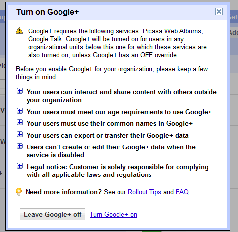
As promised, Google+ is now available for Google Apps users. Administrators can enable the new service from the control panel, as explained here. Google+ requires that Picasa Web Albums and Google Talk are enabled and that the organization uses the new accounts infrastructure. If the two services are enabled and the option to automatically add new services is selected, Google+ is automatically enabled.
After the enabling the service, you need to wait a few minutes until you can use it. Obviously, users have to manually join Google+ by visiting plus.google.com. "Google Apps users will have access to the same set of features that are available to every Google+ user, and more. In addition to sharing publicly or with your circles, you'll also have the option to share with everyone in your organization, even if you haven't added all of those people to a circle," explains Google.
It's interesting that Google+ is available for higher education institutions, but not for other education institutions because users must be at least 18 years old to use Google+.
You probably noticed that Google+ evolves incredibly fast, faster than any other Google service. The support for Google Apps is not the only new feature: there's Hot on Google+ (a section that highlights popular posts), Ripples (a visualization tool for public shares and comments) and a Creative Kit for photo editing powered by Picnik.
Wednesday, October 26, 2011
What's New in Chrome 15?
Chrome 15 brings a few changes and some new features. Here are some of them:
1. A redesigned new tab page inspired by mobile interfaces. There are two "homescreens" for apps and most visited pages, but you can create a new "homescreen" by dragging apps and pages to the bottom bar and selecting the new "homescreen". You can also remove pages and apps by dragging them to the bottom bar and then to trash area ("remove from Chrome"). Any bookmark can now become app: just drag it to the new tab page. This also works for the most visited pages.
2. The extension manager is now a section of the options page and has a new interface. You can now use the inline search box to find extensions. The old interface is displayed if you type chrome://extensions in the address bar, while the new address is: chrome://settings/extensions.
3. Chrome's menu has changed: the bookmarks menu is easier to find and there's a new item for Chrome sync.
4. If you don't like Chrome's print preview page, use a shortcut to open the native print dialog: Ctrl+Shift+P (Cmd-Shift-P for Mac).
5. You can now print headers and footers.
Can you find other new features?
Google Tests a New Search Interface for Tablets
Google experiments with a slightly different search interface for tablets. There's a new settings button below the search box that lets you disable SafeSearch and use the advanced search filters. The most popular specialized search engines are no longer hidden behind a small arrow: the new interface mimics the desktop UI and displays a list of search engines, followed by a "more" link. It's quite obvious that the navigation bar starts to become unnecessary, now that the settings button and most navigation links are displayed below the search box.
Three months ago, Google launched an interface optimized for iPad and Android tablets.
Tuesday, October 25, 2011
Chrome Web Store's Redesign
As promised, Google's Chrome Web Store has a new interface that uses promotional images and larger screenshots, opens extension pages in overlays and makes it easier to install extensions, themes and apps. Another change is that the new version is a lot faster as it uses AJAX to load extension pages. Infinite scrolling replaces pagination, so you no longer have to click "next".
"Promotional images are your chance to capture users' attention and entice them to learn more. Don't just use a screenshot; your images should primarily communicate the brand," suggests Google in the documentation.
Unfortunately, search results are now terrible, as you can see in the screenshot above. When searching for [Gmail], from the top 10 search results, only 2 extensions and apps are relevant. The top search result for [YouTube] is AdBlock, while the first result for [Google Docs] is FB Photo Zoom. The search algorithm is not good enough and Google made things worse by mixing the results for extensions and apps.
The new interface is only available in Chrome and Chromium, so you can go to https://chrome.google.com/webstore in a different browser to see the old interface.
{ Thanks, Costin and Jérémy. }
Monday, October 24, 2011
How Steve Jobs Influenced Google's Restructuring
Walter Isaacson's book about Steve Jobs includes some unflattering quotes about Google and Android, but it also explains Larry Page's decision to close many Google products and to create a cohesive interface for Google. After announcing that it will become Google's CEO, Larry Page met Steve Jobs, "who lived less than three blocks away", and asked for tips on how to be a good CEO. Here's how Steve Jobs described the meeting:
It's interesting to note that focus is one of the three principles of Google's new design. "With the design changes in the coming weeks and months, we're bringing forward the stuff that matters to you and getting all the other clutter out of your way," explained Google. Focus is also one of the reasons why Google closed Google Labs, discontinued Google Desktop, Google Pack, Google Health, and many other services. "This will make things much simpler for our users, improving the overall Google experience. It will also mean we can devote more resources to high impact products — the ones that improve the lives of billions of people." More wood behind fewer arrows means that the number of Google products will continue to decrease. Even Larry Page admitted back in July that "greater focus has also been another big feature for me this quarter" and that "focus and prioritization are crucial given our amazing opportunities".
Steve Jobs was a role model for Larry Page and Sergey Brin. When Google's founders wanted to find a CEO for Google, Jobs was a perfect match. "One person, and one only, had met their standards: Steve Jobs. This was ludicrous for a googolplex of reasons. Jobs was already the CEO of two public companies. In addition, he was Steve Jobs. You would sooner get the Dalai Lama to join an Internet start-up." (from "In the Plex", by Steven Levy). "From the earliest days of Google, whenever Larry and I sought inspiration for vision and leadership, we needed to look no farther than Cupertino," wrote Sergey Brin after hearing that Steve Jobs died.
We talked a lot about focus. And choosing people. How to know who to trust, and how to build a team of lieutenants he can count on. I described the blocking and tackling he would have to do to keep the company from getting flabby and being larded with B players. The main thing I stressed was focus. Figure out what Google wants to be when it grows up. It's now all over the map. What are the five products you want to focus on? Get rid of the rest, because they're dragging you down. They're turning you into Microsoft. They're causing you to turn out products that are adequate but not great.
It's interesting to note that focus is one of the three principles of Google's new design. "With the design changes in the coming weeks and months, we're bringing forward the stuff that matters to you and getting all the other clutter out of your way," explained Google. Focus is also one of the reasons why Google closed Google Labs, discontinued Google Desktop, Google Pack, Google Health, and many other services. "This will make things much simpler for our users, improving the overall Google experience. It will also mean we can devote more resources to high impact products — the ones that improve the lives of billions of people." More wood behind fewer arrows means that the number of Google products will continue to decrease. Even Larry Page admitted back in July that "greater focus has also been another big feature for me this quarter" and that "focus and prioritization are crucial given our amazing opportunities".
Steve Jobs was a role model for Larry Page and Sergey Brin. When Google's founders wanted to find a CEO for Google, Jobs was a perfect match. "One person, and one only, had met their standards: Steve Jobs. This was ludicrous for a googolplex of reasons. Jobs was already the CEO of two public companies. In addition, he was Steve Jobs. You would sooner get the Dalai Lama to join an Internet start-up." (from "In the Plex", by Steven Levy). "From the earliest days of Google, whenever Larry and I sought inspiration for vision and leadership, we needed to look no farther than Cupertino," wrote Sergey Brin after hearing that Steve Jobs died.
Blogger to Integrate With Google+
When you edit your Blogger profile, Blogger shows a message at the top of the page that says: "Connect Blogger to Google+: Use your Google profile and get access to upcoming Google+ features on Blogger". Unfortunately, the links seem to be broken, but both URLs reference profile switching.
It's obvious that Blogger profiles will be discontinued and replaced by Google Profiles, but it's not clear how Blogger will integrate with Google+. Maybe Blogger posts will automatically trigger Google+ posts and Blogger/Google+ comments will be synchronized. Friend Connect will be discontinued and Google+ could replace it. Friend Connect's goal was to "help site owners easily provide social features for their visitors. Users gain the ability to sign in to, make friends on, and interact with your site, making it more social and more dynamic". It wasn't successful, but Google+ has a better chance to make Blogger more social.
Update: Blogger's blog informs that this option is available if you use Blogger in Draft and it will be released in the regular Blogger interface in the coming weeks. For now, the only changes are that the Blogger profile redirects to the Google profile, the author's name is now obtained from Google Profiles and Google's snippets for the blog posts include information about authors: name, thumbnail and link to the profile. "If you blog under a pseudonym and do not want your blog to be associated with your real name, you should not migrate from a Blogger profile to a Google+ profile," suggests Google. If you change your mind after switching to the Google+ profile, you can revert to the Blogger profile.
{ Thanks, Herin. }
Saturday, October 22, 2011
Google's Plus Operator, No Longer Available
The plus operator from Google Search was useful to highlight one or more keywords that had to be included in the search results exactly as you typed them. If you search for [ai], Google matches terms like "artificial intelligence", "Amnesty International", "Art Institutes", "Appraisal Institute", "Adobe Illustrator" and that's not so useful. To restrict the results to pages that include "ai", you had to replace your query with [+ai]. Unfortunately, the plus operator is no longer available and you now have to use quotation marks even for single words and search for ["ai"].
"Google employs synonyms automatically, so that it finds pages that mention, for example, childcare for the query [ child care ] (with a space), or California history for the query [ ca history ]. But sometimes Google helps out a little too much and gives you a synonym when you don't really want it. By putting double quotes around a single word, you are telling Google to match that word precisely as you typed it," informs the Web Search help center.
The plus operator was easier to use for single words and it was intuitive, considering that the minus operator is employed to exclude results that contain a certain word. Maybe Google wants to use the operator to integrate Web Search with Google+.
{ Thanks, 7E. }
Thursday, October 20, 2011
Google Reader Will Integrate With Google+
A lot of people expect a redesigned Google Reader and the good news is that they won't be disappointed: a new interface will be available next week. Google Reader is not dead, but the new interface couldn't be released faster because the sharing feature had to be integrated with Google+.
My favorite feature of Google Buzz was that it automatically imported all the shared items from Google Reader and allowed your followers to discuss them. Now that Google Buzz will be discontinued, this feature will be available in Google+. Unfortunately, Google Reader will no longer have a standalone sharing feature, a separate list of followers and people you follow, a feed and a page for shared items. This is great if you are a Google+ user, since it simplifies sharing and makes Google Reader more consistent. If you don't want to use Google+, you'll still be able to share posts by email or using the "send to" feature, but these workarounds aren't very useful for sharing a large number of posts.
The takeaway is that Google+ is not a distinct social service you can easily ignore, it's a service that will be used for sharing photo albums, documents, videos, for posting blog comments and it will be very difficult to use Google without joining Google+ since, at some point, Google+ will be... Google itself.
"Many of Reader's social features will soon be available via Google+, so in a week's time we'll be retiring things like friending, following and shared link blogs inside of Reader. We think the end result is better than what's available today, and you can sign up for Google+ right now to start prepping Reader-specific circles. We recognize, however, that some of you may feel like the product is no longer for you," mentions Google's Alan Green. That's the reason why you'll be able to export your shared items, your starred and liked items, your list of friends from Reader's settings page.
Google Reader's sharing feature has always been difficult to use and the integration with Google+ will finally give Reader the opportunity to shine and show why it's still a useful service. I'm sure that a lot of users will complain that they can't use the old sharing feature, just like many YouTube users complained when Google migrated YouTube to Google Accounts. There's a lot of value in having separate services with their own accounts, sharing features and friends lists, but switching to unified accounts, unified profiles, consistent sharing features makes Google's services more useful because they work together, they combine their strengths and become easier to use.
A New Look for Gmail
A video from Google's YouTube channel (update: the video is now private, but there's a mirror here) introduces a new Gmail interface. It's based on the Preview theme that's already available in Gmail, but there are many other changes: an action bar that uses icons instead of text labels, a completely new interface for conversations, profile pictures next to contacts, a flexible layout that adapts to any window size, display density options like in Google Docs, resizable chat/labels sections, new high-definition themes and an updated search box that includes advanced options.
I don't see the new interface yet, but it will probably be available soon. It's interesting that there's an arrow next to "Mail" and the links to Google Contacts and Google Tasks are missing. Maybe you'll be able to use the arrow to switch to other Google services.
{ Thanks, Carlos. }
I don't see the new interface yet, but it will probably be available soon. It's interesting that there's an arrow next to "Mail" and the links to Google Contacts and Google Tasks are missing. Maybe you'll be able to use the arrow to switch to other Google services.
{ Thanks, Carlos. }
New Icons for Games and Music in Google Chrome
The latest Dev Channel release of Google Chrome for Chromebooks added two icons to the new tab page. They're similar to the Chrome Web Store icon, but they're for games and music. At the moment, the new icons don't send users to some special pages, but it's likely that they'll be used to promote the games section from the Chrome Web Store and an updated Google Music.
As AllThingsD reports, "Google is finally close to launching a music service with help from the labels". The news was confirmed by Andy Rubin, Google's Senior Vice President of Mobile. "Google is in the very, very early phases of adding consumer products to our portfolio. The media industry didn't see us as that. They saw us a search company," Andy Rubin said, trying to explain why it takes so long to launch a music store and other similar services. At the moment, Google Music is an invite-only service that lets you upload up to 20,000 songs and stream them to any computer, iOS or Android device.
{ Thanks, Sean. }
Wednesday, October 19, 2011
Android Ice Cream Sandwich
Google and Samsung launched Galaxy Nexus, the third Nexus Smartphone, and Ice Cream Sandwich (ICS), the new Android version that brings many of the Honeycomb features to smartphones. Ice Cream Sandwich is the first Android version that will work on smartphones, tablets and TVs, but today's launch only focused on smartphones.
Android 4.0 brings a polished interface that's more visual, more consistent and more interactive. Hardware buttons are replaced by virtual buttons in phones like Galaxy Nexus and Android 4.0 supports this change, while also allowing users to temporarily hide the buttons. Contextual menus are now displayed consistently at the top of the screen, so it's easier to find them. The menu button has been replaced by a recent apps button that lets you switch to an app you've used recently. This feature was already available in Android, but the new interface uses thumbnails and it looks much better.
Just like in iOS, you can now create folders by dragging one app onto another app. You can also uninstall apps or disable pre-installed apps from the launcher. That's a good news for users because many carriers bundle applications that aren't very useful.
Widgets are now resizable and can include more features, just like a regular app. The standard widgets are more powerful and you'll probably use them more often instead of opening the corresponding apps.
You no longer have to unlock a phone to check the latest notifications, see the album art of the song that's currently playing or open the camera app. You can now respond to incoming calls using text message templates and dismiss individual notifications. There's also Face Unlock, a simple way to unlock a device using facial recognition.
The soft keyboard has been improved and it offers better suggestions. There's a new spell-checker that underlines errors and suggests how you could fix them.
Android's voice input engine lets you dictate a text without having to pause. "Users can speak continously for a prolonged time, even pausing for intervals if needed, and dictate punctuation to create correct sentences. As the voice input engine enters text, it underlines possible dictation errors in gray."
There's a new People app that integrates with Google+ and other social services, an updated calendar app that allows other applications to add events, visual voicemail in the phone app, a camera app that supports continuous focus, zero shutter lag exposure, stabilized image zoom, focus detection and single-motion panorama. The redesigned Gallery app focuses on functionality instead of eye-candy and makes it easier to edit photos and sort albums by time, location, people and tags.
Android finally allows users to take screenshots without installing additional apps. The browser syncs bookmarks with Google Chrome, lets you save pages for offline reading and has an option to change the user agent of the browser so you can go to the desktop version of a page. Android's browser includes V8's Crankshaft update which improves JavaScript performance. "In benchmarks run on a Nexus S device, the Android 4.0 browser showed an improvement of nearly 220% over the Android 2.3 browser in the V8 Benchmark Suite and more than 35% in the SunSpider 9.1 JavaScript Benchmark." The tabs share the interface used for switching to a recent app.
The email app brings better contact auto-completion, templates, integrated menu for accounts and labels, nested subfolders and searching across folders on the server. NFC is now used in Android Beam, a simple way to share contacts, apps, videos with compatible devices. "It's incredibly simple and convenient to use — there's no menu to open, application to launch, or pairing needed. Just touch one Android-powered phone to another, then tap to send."
The reference device for Android 4.0 is Galaxy Nexus, a Samsung smartphone that uses a 4.65" Contour Display (HD Super AMOLED) with a 1280 x 720 resolution, a dual core 1.2GHz processor and has support for LTE or HSPA+, depending on the carrier. The phone will be launched next month in the US, Canada, Europe and Asia. Obviously, you shouldn't expect to be able to update Nexus S or other Android devices to ICS before the Galaxy Nexus launch.
Here's a video that showcases most of the Android ICS features, followed by a Galaxy Nexus ad:
{ via Google Mobile Blog }
Google Shows Your IP Address
One way to find your IP address is to search for [my ip] using Google and click the top search result. Now it's no longer necessary to go to the first result because Google answers your questions and shows your IP. You can use: [my ip], [my ip address], [show my ip], [what is my ip] and other similar queries.
"Just like a street address determines the recipient of a letter, an IP address (short for Internet Protocol address) is used to identify computers on the Internet. When your computer sends a request, such as a Google query, it tags the request with its IP address in order for the response to be sent back to your computer -- just like a return address on a letter. (...) When you type the query [ what is my ip ], Google will respond by showing you the IP address of the computer from which the query was received. In the simplest case, this IP address uniquely identifies your computer among all computers on the Internet," explains Google.
{ Thanks, Venkat. }
Tuesday, October 18, 2011
Google WebGL Bookcase
Google developed a WebGL app that shows a 3D model of a bookcase with more than 10,000 titles. "We designed a digital bookcase that's an infinite 3D helix. You can spin it side-to-side and up and down with your mouse," suggests Google.
WebGL Bookcase groups books into 28 categories and lets you choose one of them by clicking the button from the top of the page. The animation is impressive. Unfortunately, after selecting one of the books, the application sends you to Google Books to read it. If you have a mobile phone and an app that reads QR codes, you can open the book on your phone.
This could turn into a very cool app for tablets. A future Google Books app for iPad and Android tablets could help users explore the books that are available and even create a special section for the books already owned by the users.
For now, the app requires a browser that supports WebGL (Chrome, Firefox) and a computer with a compatible graphics card. "We recommend using Google Chrome and a fast computer with a powerful graphics card. Even with new hardware, this interface is experimental and may not work on some machines," informs Google. I tried WebGL Bookcase in the latest Aurora (Firefox 9 Alpha 2) builds and it works pretty well. Unfortunately, the app can't open books in Firefox 7.
Google Encrypted Search for Logged-in Users
Google announced that in the coming weeks all Google.com users that are logged in will be redirected to Google Secure Search. The secure version of Google Search has been launched last year and now includes all the features from the regular Google interface. The main difference is that the connection is encrypted and Google is the only one who knows the queries you've typed. ISPs, network administrators, those who intercept your connection and the webmasters of the pages from Google's search results won't able to find your searches. "SSL encrypts the communication channel between Google and a searcher's computer. When search traffic is encrypted, it can't easily be decoded by third parties between a searcher's computer and Google's servers," as Google says.
"As search becomes an increasingly customized experience, we recognize the growing importance of protecting the personalized search results we deliver. As a result, we're enhancing our default search experience for signed-in users. Over the next few weeks, many of you will find yourselves redirected to https://www.google.com (note the extra 's') when you're signed in to your Google Account. This change encrypts your search queries and Google's results page. This is especially important when you're using an unsecured Internet connection, such as a WiFi hotspot in an Internet cafe," explains Google.
Right now, https://www.google.com no longer redirects to https://encrypted.google.com and Google no longer informs users that they're using Secure Search. It's important to keep in mind that no other search engine offers this feature and SSL has a performance penalty, which means that search results pages will load slower. This is especially noticeable when you use Google Instant and the results won't show up as fast as before.
After the security incident from December 2009, Google went to great lengths to make its services more secure. Most services that require authentication default to SSL and many no longer offer unencrypted versions. It's interesting to see that Google Search will be treated just like Gmail, Google Docs, Google+ and other services that store user data even if this change won't make too many people happy (users will complain that search results pages load slower, webmasters will complain that their logs will be less useful, AdSense ads from search results will no longer be able to use the Google query and fewer users will click them, companies won't be able to monitor their employees' Google searches). Google already offers some solutions that address these issues: webmasters can use Google Webmaster Tools to find the most popular Google searches that sent users to their sites, while network admins can try the NoSSLSearch option.
It's an important change, but I don't see why signed-in users should be treated differently and why protecting user queries outweighs the drawbacks mentioned earlier. One of the explanations could be that search will no longer be a distinct service and will integrate with Google+, Gmail, GoogleDocs Drive so much that it will be hard to notice when you've switched to a different app. Larry Page, Google's CEO, has recently said that "our ultimate ambition is to transform the overall Google experience, making it beautifully simple, almost automagical, because we understand what you want and can deliver it instantly. This means baking identity and sharing into all of our products so that we build a real relationship with our users. Sharing on the Web will be like sharing in real life across all your stuff."
"As search becomes an increasingly customized experience, we recognize the growing importance of protecting the personalized search results we deliver. As a result, we're enhancing our default search experience for signed-in users. Over the next few weeks, many of you will find yourselves redirected to https://www.google.com (note the extra 's') when you're signed in to your Google Account. This change encrypts your search queries and Google's results page. This is especially important when you're using an unsecured Internet connection, such as a WiFi hotspot in an Internet cafe," explains Google.
Right now, https://www.google.com no longer redirects to https://encrypted.google.com and Google no longer informs users that they're using Secure Search. It's important to keep in mind that no other search engine offers this feature and SSL has a performance penalty, which means that search results pages will load slower. This is especially noticeable when you use Google Instant and the results won't show up as fast as before.
After the security incident from December 2009, Google went to great lengths to make its services more secure. Most services that require authentication default to SSL and many no longer offer unencrypted versions. It's interesting to see that Google Search will be treated just like Gmail, Google Docs, Google+ and other services that store user data even if this change won't make too many people happy (users will complain that search results pages load slower, webmasters will complain that their logs will be less useful, AdSense ads from search results will no longer be able to use the Google query and fewer users will click them, companies won't be able to monitor their employees' Google searches). Google already offers some solutions that address these issues: webmasters can use Google Webmaster Tools to find the most popular Google searches that sent users to their sites, while network admins can try the NoSSLSearch option.
It's an important change, but I don't see why signed-in users should be treated differently and why protecting user queries outweighs the drawbacks mentioned earlier. One of the explanations could be that search will no longer be a distinct service and will integrate with Google+, Gmail, Google
Gmail Tests a Huge Image Ad
Who would have expected to see a giant image ad on Gmail's sign out page? For now, it's just an experiment and it's displayed when you log out from Gmail, but I bet that Gmail users won't be happy to see it when it will no longer be an experiment.
One of the great things about Gmail was that the ads were relevant and unobtrusive. The huge ad for Vistaprint is not relevant and it's really obtrusive. "With Gmail, you'll never see pop-ups or untargeted banner ads. Instead we display text ads and related links you might find useful and interesting." This was one of the top 10 reasons to try Gmail, but it was removed from this page.
A Gmail help page explains that "occasionally we may show a banner ad on the Gmail logout page. This ad is different from other ads in Gmail since it's not related to the content of your Gmail account. Instead, it's the same type of ad that appears on the YouTube homepage."
New York Times reported in May that "Gmail will begin allowing advertisers to use images. For example, an e-mailed offer for a ski package showing a skier on the slopes could be accompanied by an ad on the right side of the screen, showing a competing offer, replete with another skier coming down another slope. The image used in the ad would be static, not animated, and would be used only in cases where the e-mail message itself showed images."
{ Thanks, Gary. }
New Colors in Google Calendar
Google Calendar updated the color palette and you can now choose from 24 colors that match the new interface. "The color of each of your calendars has been updated to use the closest possible color from the new palette. The new colors will only be available in the web interface (for example, you won't see these colors if you're accessing Calendar via your mobile phone)," informs Google.
It's worth mentioning that the new colors are only available if you use Google Calendar's new UI. To switch to the new interface, click the Options menu in the navigation bar and select "Try the new look". You can always go back to the old UI from the same menu.
{ Thanks, Cougar, Ralph and Herin. }
It's worth mentioning that the new colors are only available if you use Google Calendar's new UI. To switch to the new interface, click the Options menu in the navigation bar and select "Try the new look". You can always go back to the old UI from the same menu.
{ Thanks, Cougar, Ralph and Herin. }
Subscribe to:
Posts (Atom)