Thursday, September 29, 2011

How to Find Visited Pages in Google Search

I'm not sure if this is a new feature, but it's pretty useful. Like most websites, Google's search engine changes the color of visited links from blue to purple. All browsers handle links this way by default, but websites can alter the colors using some CSS code.

If you're logged in using your Google Account and Web History is enabled, Google saves all the search results you visit to your Web History. When you're using a different browser or a different computer and you're logged in using the same account, Google changes the color of the visited links from blue to purple, irrespective of the browser or computer you've used to visit them. For example, I searched for [haploid] using Chrome, I clicked on one of the results, then I tried the same query in Internet Explorer and the page I've visited in Chrome already had a purple link.


Google also has a search filter that lets you restrict the results to visited pages. Just click "More search tools" in the sidebar and select "Visited pages". For pages you're visiting frequently, Google shows an annotation below the snippet: "You've visited this page X times. Last visit: ...". When you mouse over the snippet, Google suggests to +1 the link: "You've visited this page X times. +1 to recommend it on Google search!".


{ Thanks, KoalaBear. }

Wednesday, September 28, 2011

"Google+ Is Google Itself"

If you thought that Google+ is just a separate service you can easily ignore if you don't want to use it, you were wrong. In an interview with Steven Levy, Bradley Horowitz - Google's VP of products - says that Google+ is actually Google itself.
Until now, every single Google property acted like a separate company. Due to the way we grew, through various acquisitions and the fierce independence of each division within Google, each product sort of veered off in its own direction. That was dizzying. But Google+ is Google itself. We're extending it across all that we do — search, ads, Chrome, Android, Maps, YouTube — so that each of those services contributes to our understanding of who you are.

Redesigning all Google services to match the Google+ interface is not just about consistency, it's also a way to show that they're part of the same super-service, an encompassing layer that makes them work together.

Google+ made Android's camera app integrate with Picasa Web Albums, Google Talk integrate with YouTube and Google Docs. It's likely that Google+ will make Google services more useful by combining their strengths. That's probably the reason why you'll use Google+ even when you're not going it to Google+ and you'll end up joining Google+ even if you don't like social networks.

Google Instant Tweaks

When Google launched Instant, the main goal of this feature was to guess your query before you finish typing it and to instantly display the results. This works well if your typing a popular query, but what happens when Google can't autocomplete your query and you're a slow typist? You'll usually see the results for partial queries that include the words you haven't finished typing.

Now Google no longer includes the word you're currently typing if it's not very likely that it's a complete word. If you type [android qualcomm qua], Google will only show the results for [android qualcomm]. When your query becomes [android qualcomm quad], Google no longer ignores the third word. Here's another example:


If you actually want to find the results for a query and Google ignores the last word, you can always press Enter, click the Search button or click "Search instead for ...".

Dynamic Views, New Blogger Templates

Blogger launched in March five blog views that used cutting-edge technologies to transform a blog into a Web app. Back then, visitors had to enter a special URL like gmailblog.blogspot.com/view/sidebar or install a Chrome extension to switch to one of the new interfaces. Six months later, Blogger created two new views (classic and magazine) and added the list of dynamic views to Blogger's template editing section so that blog authors can replace their template with one of the seven views that are now available.


There are three kinds of dynamic views: photo-oriented templates (flipcard, mosaic, snapshot), text-oriented templates (classic, sidebar) and magazine-like templates (magazine, timeslide). If you don't have a photoblog, classic, sidebar and magazine are the best dynamic views for your blog. Blogger's new templates bring a lot cool features and change the way readers interact with a blog. Infinite scrolling replaces pagination, blog posts are loaded using AJAX, Blogger caches blog posts so they load faster, images are downloaded as you browse, you can use keyboard shortcuts (j/k or n/p) to go to the next or previous post just like in Google Reader. There's also instant search that shows the list of results as you type.


While dynamic views have many cool features, there are also many downsides. They're not very customizable: you can only upload a header image and customize the background colors. When you pick one of the views, all the gadgets you've added will disappear. It's also annoying that blog posts no longer open in separate pages: they open either in lightbox-like panes or in a homepage-like interface, next to other posts (here's an example). Just like the mobile template, dynamic views only work with Blogger's commenting system, so you won't be able to use Disqus. It will be interesting to see how search engines handle the new templates, considering that blog posts are loaded using JavaScript and HTML pages are almost empty.

I don't intend to switch to one of the dynamic views, but my favorite templates are sidebar and magazine. You can always bookmark these links or use Google's Chrome extension, which needs to be updated to add support for the two new dynamic views. Some Google blogs have already switched to the new templates: Blogger Buzz, Gmail Blog, Google Docs Blog and LatLong.

Google Reader, Replaced by Google Sites in the Navigation Bar

Google Reader users probably noticed that the feed reader has been replaced by Google Sites in the main navigation bar. To visit Google Reader, they need to click "More" and then click "Reader" in the list of Google services.


Unlike the last time when Reader was replaced by Google Sites, this time is not an accident. A Google employee explained that this is a permanent change.
While the link to Reader has moved, you can continue to access Google Reader under the "More" dropdown. Or, you can also set a specific bookmark to reader.google.com for one-click access. Depending your browser, try dragging http://reader.google.com right from this post onto the bookmark bar on your browser (usually below the URL bar).

Google has usually made changes in the navigation based on the popularity of the services and it's likely that Reader's popularity is declining, while Google Sites gains more users. According to Google Trends, the queries [google reader] and [google sites] have almost the same search volume in the US.


Like Picasa Web Albums, Google Reader doesn't have a new interface based on Google+. The latest features added to Google Reader were comment moderation and integration with Google Buzz, a service that will soon disappear.

{ Thanks, Cougar. }

Friday, September 23, 2011

Google's New Search Interface Disables Many Shortcuts

With the latest redesign of the search results pages, Google made it more difficult to use most of the keyboard shortcuts that allowed you to quickly select a result or see a small preview.

Until now, you could type your query, press Enter to hide the list of suggestions and press Enter once again to go to the first result. If you didn't like the first result, you could press the down arrow to select the second result. Google also included a keyboard shortcut for Instant Previews: the right arrow. None of these shortcuts are available in the latest interface, at least not by default. Now you need to press Tab after performing a search to enable the old keyboard shortcuts.

Here's a search results page after typing a query (notice that there's no arrow next to the first result):


Here's what happens when you press Tab (you can use the up/down arrows, but the shortcut for Instant Previews no longer works):


Google probably disabled these features because not many people used them and a lot of users complained that the shortcuts made navigation more difficult. Power users need to learn that Tab enables keyboard shortcuts, but having to enable the feature every time you use Google Search is annoying. After all, shortcuts were supposed to make your life easier and help you be more productive.

Google Instant shortcuts are still available. You can continue to use the up/down arrows to select a different search suggestion, the right arrow to visit the first result for the search suggestion, Tab to use Google's suggestion and continue to type your query, Esc to select the query so you can quickly overwrite it.

{ via Google Search Help Forum }

Thursday, September 22, 2011

New Interface for Google Instant Previews

Google tweaked the UI for Instant Previews and made the search interface a lot cleaner. There's a new large icon for Instant Previews, but it's only displayed when you mouse over a snippet. Click the new icon or only hover over the gray bar and you'll see a much bigger screenshot.


"Instant Previews have been around since last year, allowing you to click on the magnifying glass to the right of the result to see a visual overview of a page. Now these previews are no longer even a click away: if you move your mouse over a search result, arrows will appear. Hover over them to see a visual preview of that result," explains Google.

Clicking the snippet no longer triggers an Instant Preview in the new interface. Unfortunately, the keyboard shortcut has been disabled, so you can longer get a glimpse of the page using the right arrow.

Google now repeats the title of the page and the URL next to the screenshot, while the links to the cached page and to other similar pages are included in the new enlarged snippet. It's a bad news for those who frequently use the "cache" link, who now have to spend more time to find it.

The only action that's still displayed is the Google +1 button, but you need to log in to see it. Probably Google wanted to emphasize the button, which is now placed next to the URL.

Here's the old interface:

Body Browser, No Longer a Google Service

One of the coolest apps launched by Google last year will have a new owner. Google Body Browser was a great way to show the power of WebGL, but it was also a useful app for exploring the human body. Body Browser will continue to exist, but it will be owned by Zygote Media Group.
As Google Labs winds down, we will be retiring Google Body. However, you will soon be able to find its functionality elsewhere. We are working on open-sourcing the code that powers Google Body so that anyone will be able to create and run a searchable 3D viewer. We are also working with our partner, Zygote Media Group, on an application called Zygote Body. This application will be free, available on the web and on Android, and will enable students, teachers, and others using Google Body to continue to have access to a human anatomy browser.


Tuesday, September 20, 2011

Google Wallet

Google found an interesting way to launch the Google Wallet app for Android: as an over-the-air update for Sprint Nexus S 4G phones. Google Wallet makes use of the NFC chip from Nexus S phones and allows you to make credit card payments at physical stores using your Android smartphone.

"Google Wallet enables you to pay with your Citi MasterCard credit card and the Google Prepaid Card, which can be funded with any of your existing plastic credit cards. As a thanks to early adopters, we're adding a $10 free bonus to the Google Prepaid Card if you set it up in Google Wallet before the end of the year," informs Google. The Google Prepaid Card is powered by MasterCard and Money Network and it's a temporary solution until you can add credit cards from other companies. Google says that the application could add support for Visa, Discover and American Express cards in the future.

Google Wallet is more than a contactless payment solution: it's a virtual wallet that could store information about your credit cards, coupons, loyalty cards, gift cards, tickets and much more. It's also a great opportunity for Google to integrate Google Offers and make it easier to use by allowing consumers to pay, redeem offers and earn loyalty points in a single step using their mobile phone. Google says that it doesn't have access to the list of products you buy, but this feature could be added in the future.

While Google Wallet seems to be a convenient solution, many people might not use it because of privacy or security reasons. Google says that the payment credentials are stored in a separate chip called Secure Element and only authorized programs can initiate transitions. Google Wallet users need to enter the PIN to confirm a payment, so someone who finds an Android phone can't use the app because he doesn't know the code.

Google's vision is to create "an open commerce ecosystem" that will support many payment instruments, APIs that enable adding loyalty points, transferring offers, receipts and more. Google Wallet is Google Checkout's extension to offline payments and it's a big opportunity for Google to create a successful payment system. PayPal will soon offer a similar service and Apple's iPhone 5 could include a NFC chip, so Google Wallet will have some competition.

Google+ for Everyone

Three months after the launch, Google+ no longer requires invitation and it's available to anyone who has a Google account. "For the past 12 weeks we've been in field trial, and during that time we've listened and learned a great deal. We're nowhere near done, but with the improvements we've made so far we're ready to move from field trial to beta," informs Google.

The service has improved a lot, more quickly than any other Google product ever released. After announcing the public data APIs, Google added support for Hangouts in the Android app and added the option to broadcast a Hangout, but only for a small number of users. "We're starting with a limited number of broadcasters, but any member of the Google+ community can tune in. In fact: we'll be hosting our very first On Air hangout with will.i.am on Wednesday night, September 21. For more information visit will.i.am's profile on Google+."


Hangout has many other features you can preview by clicking "Try Hangouts with extras": screensharing, sketchpad, Google Docs integration and named hangouts "for when you want to join or create a public hangout about a certain topic".


The search box is now more useful because you can use it to find posts from your friends and from other Google+ users. Google also lets you restrict your results to people and save your search.


Google doesn't disclose the number of Google+ users, but a Comscore report from August estimated that "in just one month, Google+ has captured 25 million visitors". It's likely that Google+ has a lot more users today and the number will grow, now that the service no longer requires invitation. Google+ is the first social service launched by Google that's actually successful.

Saturday, September 17, 2011

Blogger's Slideshow Feature

Blogger added a feature that makes it easier to view multiple photos. When you click on an image from a Blogger post, a LightBox-like overlay shows a bigger version of the image and lets you view the other images in a slideshow. The feature was borrowed from Google+, it's enabled by default and can't be disabled from the settings page.

If you want to open an image in a new tab, middle-click on the URL displayed below the image or right-click the link and select "open link in new tab". The slideshow supports keyboard shortcuts: left/right arrows, j/k, n/p to navigate, Esc to close the slideshow.


{ Thanks, Petros and Cougar. }

Thursday, September 15, 2011

Rich Snippets for Apps

Now that both the Apple App Store and the Android Market have Web interfaces, Google decided to show better snippets for the results from these sites. The next time you search for [Angry Birds], [Cut the Rope], [Shazam] or [ASTRO File Manager], you'll find results that include a small icon, the app's rating, the number of reviews and the price. For now, only the results from the Android Market include thumbnails.


Google also shows rich snippets for review sites like CNET. If you own an app store or you have a site that allows users to download software, you can get similar snippets by adding some special markup. "When you mark up software application information in the body of a web page, Google can identify it and, when users search for apps, use this information to better display your app details in search results."

YouTube's New Video Editor

YouTube has a new online video editor that lets you trim the video, rotate it, remove shaky camera motions, adjust the contrast, saturation and color temperature, apply simple effects like "sepia", "cartoon", "thermal" and add a free audio soundtrack from YouTube's library.

While the editor is pretty basic, the main advantage is that you can replace the original video, but this only works if your video has less than 1,000 views and YouTube hasn't received a copyright complaint from a third-party. There's also a "save as" option that lets you save the edited version as a new video.


How to find the new editor? Make sure you're logged in, go to "My videos & playlists" and click "Edit video" next to the video you want to edit. You can also open a video you've uploaded and click "Edit video".


To make things more confusing, YouTube has another video editor that lets you mix your videos and Creative Commons videos from other YouTube users, add audio soundtracks from YouTube's library and apply transitions.

Wednesday, September 14, 2011

Google Goggles Makes Your Phone's Camera Smarter

Google Goggles is an application that's sometimes useful, but it's not good enough to use it every time you want to find something about an object. The Android app has a new feature that integrates it with the Camera app, uploads all the photos you're taking to Google's servers and shows notifications in the status bar if Goggles found something useful. It may sound spooky, but it makes your phone's camera smarter.

"With this new opt-in feature in Goggles, you can simply photograph an image using your phone's camera, and Goggles will work in the background to analyze your image. If your photo contains items that Goggles can recognize, the app will notify you," explains Google. The feature is disabled by default, but you can enable it from the settings page by choosing "Search from Camera".


It's probably a good idea to only enable this option when you're on vacation or when you're planning to photograph barcodes for products you want to buy. It's also useful if you're in a bookstore and you want to "bookmark" some books.

Google Mobile's help center informs that "each Goggles query consumes approximately 100 KB of data" and you can limit the amount of data that's consumed by selecting "Search on WiFi networks only" under "Mobile Connection".

"Search from Camera" is one of the features that won't be available in the Google app for iPhone because iOS' background APIs aren't that powerful. If you have an Android device, install Google Goggles 1.6 from the Android Market.

More Options for Google Flight Search

Google Flight Search has a homepage, is now included in the search sidebar and offers more options, but only for US locations. Search Engine Land reports that "this is the first product to emerge from Google's controversial acquisition of travel software company ITA, which closed in April".

If you search for [flights from San Francisco to Houston] and choose "Flights" from the sidebar, Google shows a list of flights and lets you filter them by the number of stops, airline, outbound time, price and duration of flight.

There's also a dynamic map that lets you change your destination and a smart chart for filtering long and expensive flights. Just click the "limits" button and use the sliders to customize the filters. By default, Google only shows the best flights.

If you click the arrows from the From or To drop-downs, you can select some of the nearby airports. You can also enter multiple locations separated by commas.


The calendar is also smart because it lets you find the cheapest flights and plan your trips accordingly.


Once you've picked an outbound flight, you can also choose a return flight. Google sends you to the airline sites to book your flights, but it's interesting to notice that the links are labeled as ads.


"This is just an early look: the takeoff, not the final destination! You may notice that at the moment we include a limited number of U.S. cities and show results for round-trip economy-class flights only. We're working hard to improve this feature and look forward to sharing more updates," explains Google.

For locations outside of US, Google still shows a static OneBox with a list of flights, but this tool is not interactive. For some reason, Google shows the same OneBox if you enter US locations and doesn't link to the advanced flight search engine.


Update. Philip Cunningham, an eagle-eyed reader, spotted a mistake: the link to Recipe Search is spelled "receipts" in Flight Search. Another mistake is that Google still shows icons next to the specialized search options.

Tuesday, September 13, 2011

Dash, Google's Alternative to JavaScript

An internal Google document from October 2010 provides some information about Google's strategy for the future of JavaScript. Google will continue to work on improving JavaScript and adding new features to ECMAScript Harmony, but it will also develop a new language called Dash that will try to solve JavaScript's problems, while offering better performance, the ability "to be more easily tooled for large-scale projects" and better security features.
The goal of the Dash effort is ultimately to replace JavaScript as the lingua franca of web development on the open web platform. We will proactively evangelize Dash with web developers and all other browser vendors and actively push for its standardization and adoption across the board. This will be a difficult effort requiring finesse and determination, but we are committed to doing everything possible to help it succeed.

While Dash is catching on with other browsers, we will promote it as the language for serious web development on the web platform; the compiler allows such developers to target other browsers before those browsers implement Dash.

The Dash language effort will be driven by Lars Bak and his team in the Aarhus office.

Google also develops a cloud IDE called Brightly that will probably the first app written in Dash. The Dash VM and Dash Cross Compiler could be available later this year, according to the document.

"Our approach is to make an absolutely fantastic VM/Language and development environment and build great apps that fully leverage it in order to help other browsers see the wisdom in following. Once Dash has had a chance to prove its stability and feasibility, we are committed to making Dash an open standard with involvement from the broader web community," explains Google.

Update (October 10): The language is called Dart.

{ via Reddit }

Google Chrome's New Bookmarks UI

Google Chrome 15 brings some new ways to access your bookmarks. There's a new bookmarks menu below the "new incognito window" option that lets you quickly find your bookmarks. This feature is already available in Chrome 14 (now in beta), but the bookmarks menu is more prominently displayed in Chrome 15.


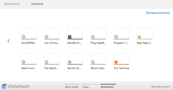
The new tab page no longer includes the bookmarks bar if this feature is disabled. The main reason for removing the bar is that the new tab page now includes a special section for bookmarks, next to the sections for apps and frequently visited pages. Bookmarks are displayed just like apps, but the thumbnails are much smaller and they seem to be blank, at least for now. You can now drag bookmarks to the list of apps, reorder them or remove them without using the bookmark manager.


While there are many advantages to the new interface for browsing and managing bookmarks, the thumbnail view is not very useful if you have a lot of bookmarks in a folder. Page titles are truncated to the first 10-15 characters and it's not always easy to find a bookmark. A list view is more space-efficient.

Google Drive, a New Name for the Google Docs Homepage?

TechCrunch has recently reported that the subdomain drive.google.com has been added to a Chrome file and a Google Docs message includes a reference to Google Drive.


The source code of Google Docs files has many messages related to "Google Drive", but all of them have one thing in common: they replace similar messages that include "Documents List". Here are two examples: "items haved been removed from your Documents List" / "items haved been removed from your Google Drive", "Add to my Documents List" / "Add to My Google Drive".


This suggests that Google Drive could be the new name of the Google Docs List, while Google Docs could be detached from the file storage interface and only be an online office suite. Google Docs is not the right name for an online storage application that lets you upload not just documents, but also music, videos, archives, photos and other files. Hopefully, the rebranding will bring more free storage, file syncing apps for mobile and desktop and integration with third-party apps.

Steven Levy's "In the Plex" included an interesting story about Google Drive being superseded by Google Docs because "files are so 1990". Google's Sundar Pichai said that "when people use our Google Docs, there are no more files. You just start editing in the cloud, and there's never a file." Google Drive might be a better name for a service that stores user files, whether they're created using Web apps, mobile apps or desktop apps.

Google Tweaks the Search Interface

After a few weeks of testing various changes to the search results pages, Google redesigned the interface and added some of the experimental features. The search options sidebar no longer uses icons, there's a new section that displays the service's name ("Search") and the number of search results.


Google also tweaked the colors of the links and URLs, as you can see in the image above, which compares the new interface (left) with the old interface (right).

Saturday, September 10, 2011

Google Groups Has a New Interface

Google Groups is the latest Google service redesigned to look like Google+. New buttons, new icons, new scrollbars, new search box and a smoother interface that makes Google's help forums look outdated.

Since the current Google Groups UI is inspired by Google Reader, we can expect to see a revamped Google Reader with a similar interface.


If you miss the small arrow that allowed you to hide the sidebar, use the "f" keyboard shortcut, which hides both the sidebar and the search box.


{ Thanks, Filipe, François and Elchanan. }

Thursday, September 8, 2011

iPhone App for Blogger

Blogger has an app for iPhone and it's better than the corresponding Android app, which has improved a lot in the past months. Both apps let you edit your existing posts and create new posts, add images to your posts, include labels and geolocate your posts.

They're pretty basic, but the iPhone app has a better interface, it's easier to use and pays attention to detail. For example, the iPhone app includes the URL of the blog next to the name when you switch to a different blog, so that it's easier to identify a blog. The Android app only shows the names. To publish a post in the iPhone app, you need to tap the "Publish" button, which is always displayed at the top of the screen. In the Android app you need to scroll to the bottom of the post to find the "publish" button.


"With the Blogger app, you can write a new blog post and publish it immediately or save it as a draft right from your iOS device. You can also open a blog post you've been working on from your computer and continue editing it while you're on-the-go. Your blog posts are automatically synced across devices, so you’ll always have access to the latest version," informs Google.

Customize Google Docs Interface

If you switched to the new Google Docs interface and wondered why there's so much whitespace, I have a good news for you: Google Docs has two new options for adjusting display density. Click the new settings drop-down and select one of the three options: comfortable (the default option), cozy and compact (similar to the old interface). My favorite option is "cozy", which is both clean and compact.


Another change is that the details pane is no longer a sidebar. If you want to find more information about a document, select it and click "Details". Google Docs will display an overlay that includes a large thumbnail, sharing information, the list of collections where you placed the document and some other information.


There's also a button for sharing the selected documents and some new icons for documents, spreadsheets, drawings, presentation and other files.

{ Thanks, Tom. }

Fusion Tables, a New Google Docs App

Aaron, a reader of this blog, spotted a new option in Google Docs: creating tables. It seems that Google Docs started to integrate with Fusion Tables, a little-known Google service that lets you manage large data sets.


I don't see "table (beta)" in Google Docs, so this could be a slow rollout or just a limited experiment. Fusion Tables already has a Google+ interface:


"Google Fusion Tables is a modern data management and publishing web application that makes it easy to host, manage, collaborate on, visualize, and publish data tables online." You can find some examples in the gallery. There are also many tutorials that help you create tables and turn them into maps.

{ Thanks, Aaron. }

New Advanced Image Search Page

Google updated the interface of the advanced image search page to look just like the corresponding Web search page. The redesigned page is easier to use, it groups the search options and includes some of the options that were only available in the sidebar.


Here's the old UI:


Why use the advanced search page instead of using the sidebar? Some of the options aren't available in the sidebar: restricting the results to a filetype, finding Creative Commons images, finding images from a domain or from a country.

There's one feature that's no longer available in the new interface. Can you find it?

iGoogle's New Interface

Google's personalized homepage has a new interface inspired by Google+. There's a prominent button for adding gadgets, a unified menu for gadgets that's hidden until you mouse over a gadget, an option to hide the sidebar and a bigger search box that supports voice search if you use Chrome. The links to the advanced search page and language tools page have been removed, while the "I'm Feeling Lucky" button is only displayed below the list of suggestions,


{ Thanks, Tim. }